
Your taste
travels.
From an everyday object
to a world with character.
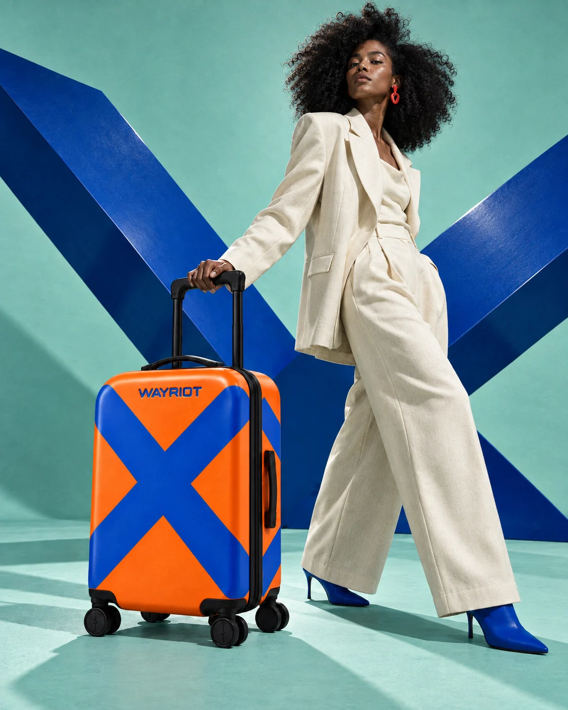
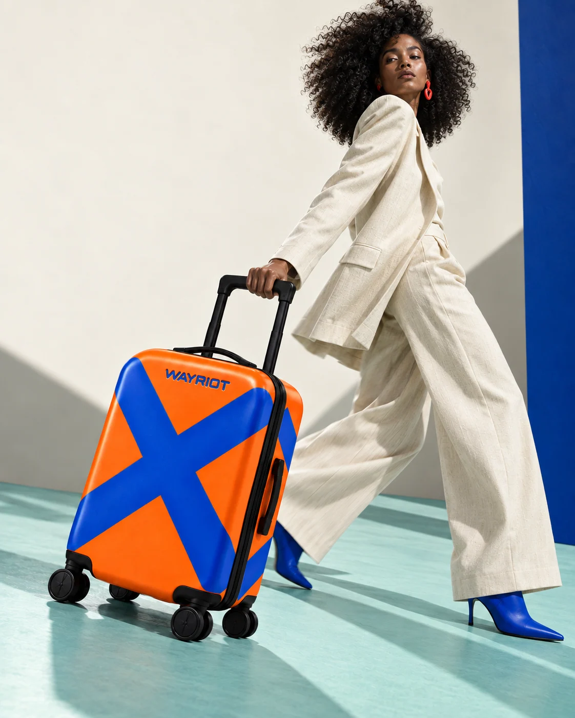
Something ordinary.
A personal point of view.
Ribbons, stickers, a small mark on a black case. Travelers find ways to make similar bags feel like theirs. Our brief asked what happens when that expression is part of the object from the beginning.
A brand for people
with a point of view.
We built the concept around young adults with an interest in fashion, music and art. The luggage should feel as considered as the clothes they wear and the places they choose to go.
The central idea, Your taste travels, connects every expression. A consistent identity gives the collection its structure; the artwork gives each case its personality.
An original studio concept for a fictional brand. Audience and positioning were working hypotheses.
Movement. Routes.
Your own direction.
Color. Energy.
Character that shows.
The selected name set the tone for the concept. Naming exploration included preliminary public-web and domain checks; it is not a commercial clearance claim.
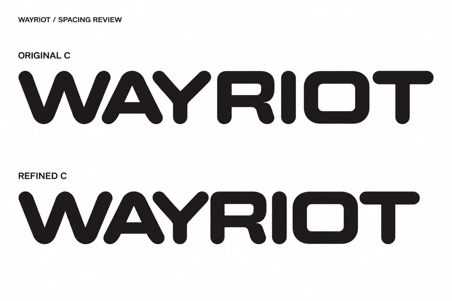
Strong letters.
A softer edge.
Rounded lettering gives an energetic name a welcoming character. We refined the spacing and built a fixed vector wordmark, so its proportions hold across the collection and campaign.

Play in the artwork.
Precision in the details.
Manrope Aa
IBM PLEX MONO / 0123456789
Manrope carries the headlines and reading. IBM Plex Mono identifies each artwork and organizes practical information. The wordmark remains its own artwork.
Short, assured language: Pack your point of view. Take the interesting turn.
Four ways
to show up.
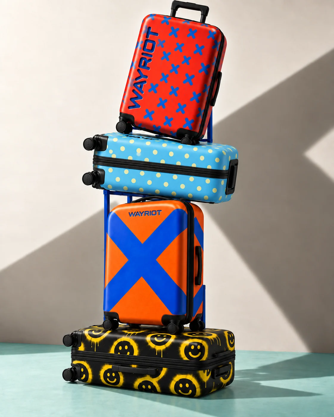
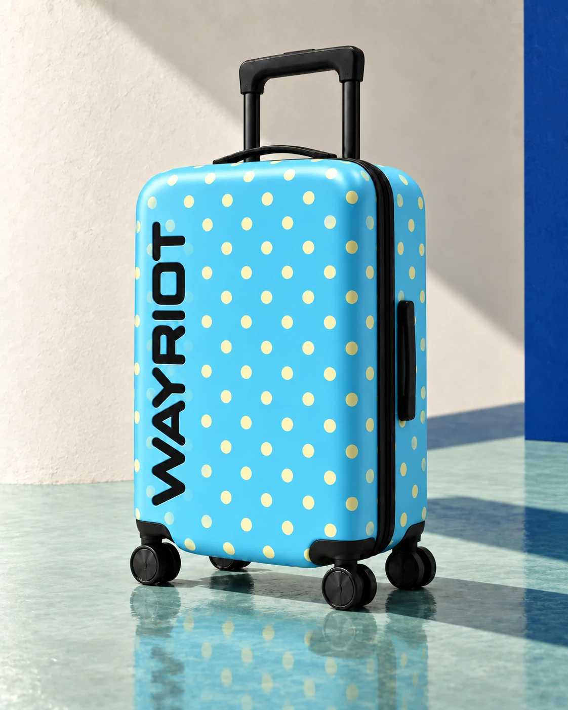
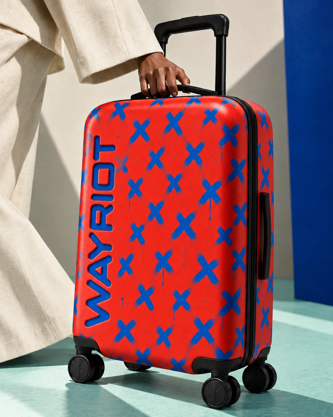
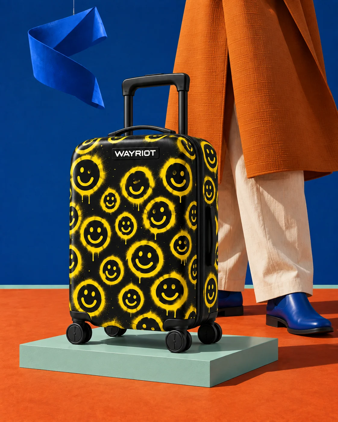
One case silhouette, black hardware and a shared wordmark connect four different moods. The placement of the name responds to each artwork.
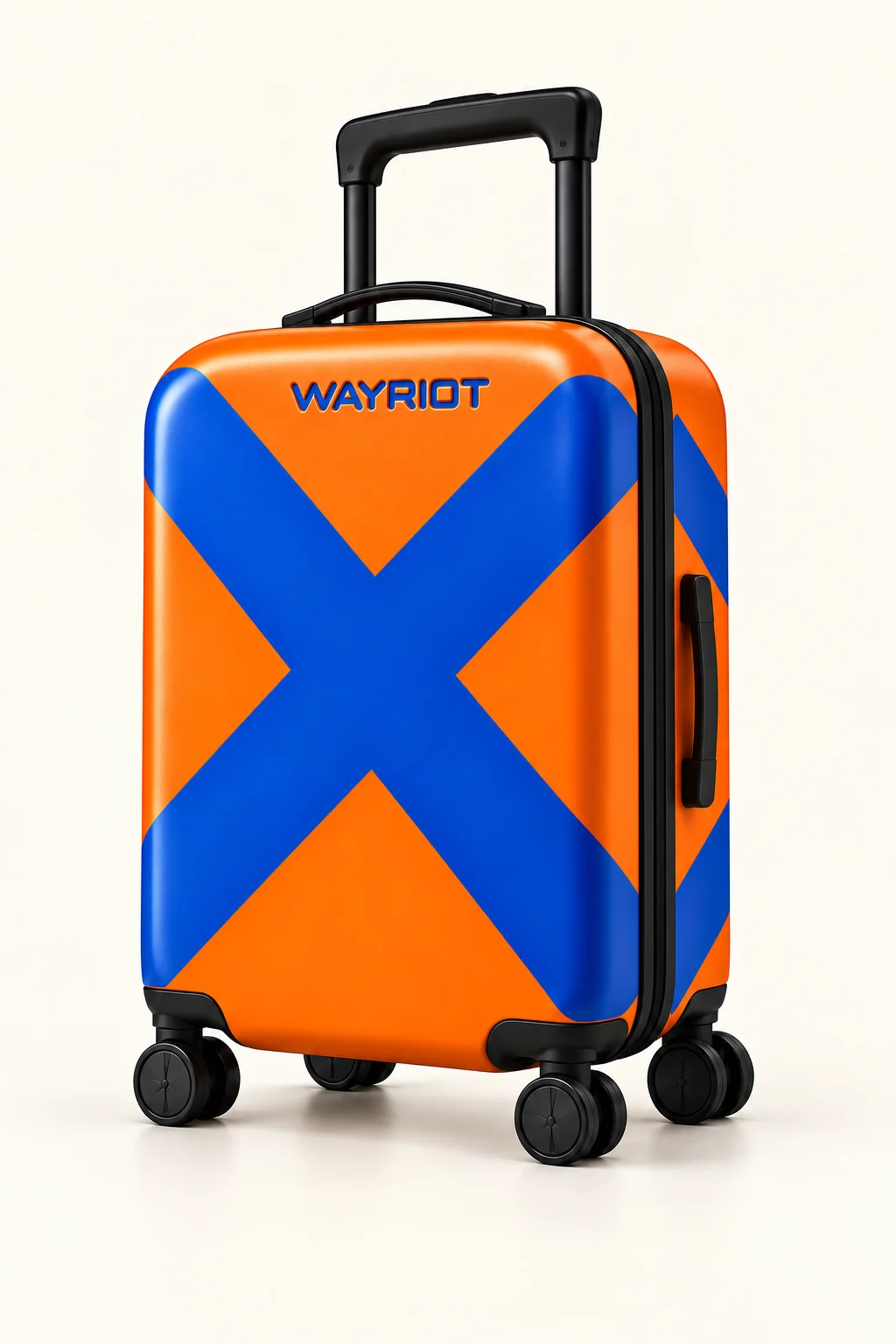
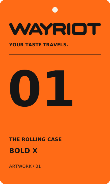
Bold X
Tangerine and cobalt. One oversized gesture, with a small recessed signature.
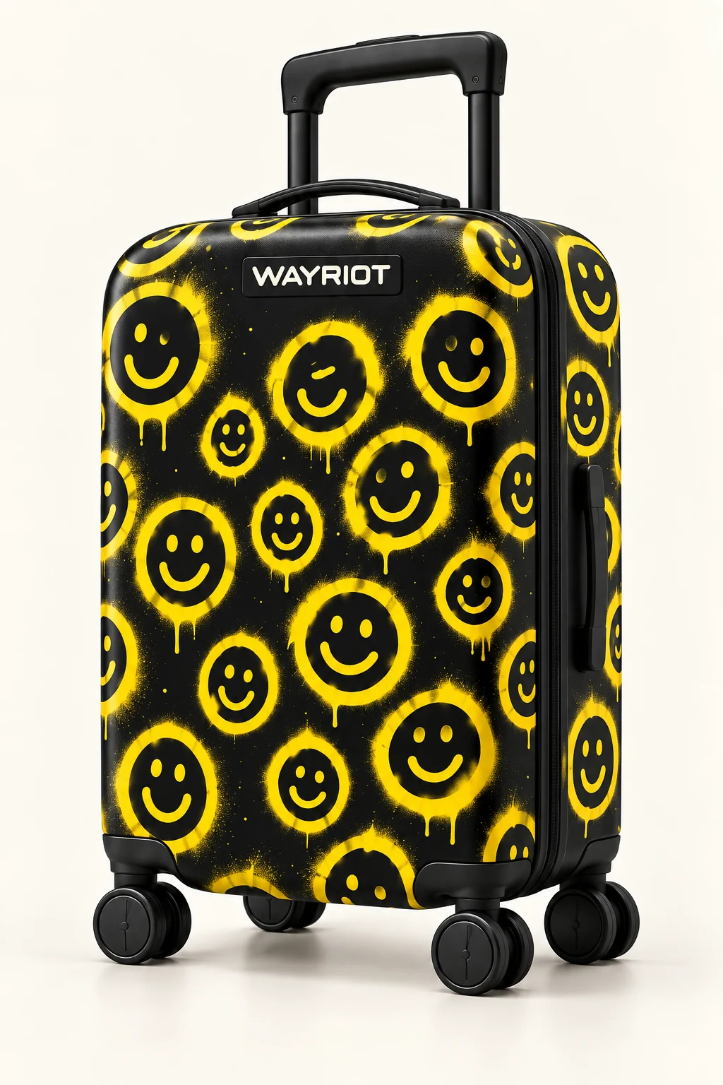
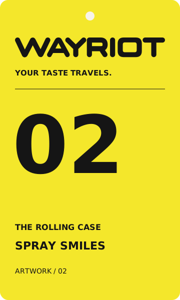
Spray Smiles
Black and yellow. Loose painted smiles, with an ivory name on a small plaque.
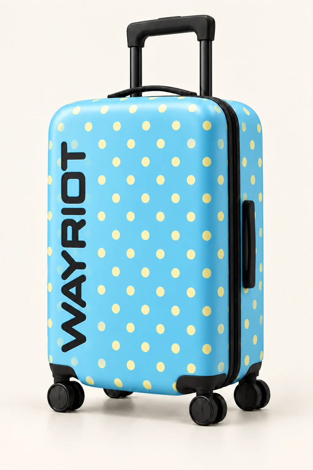
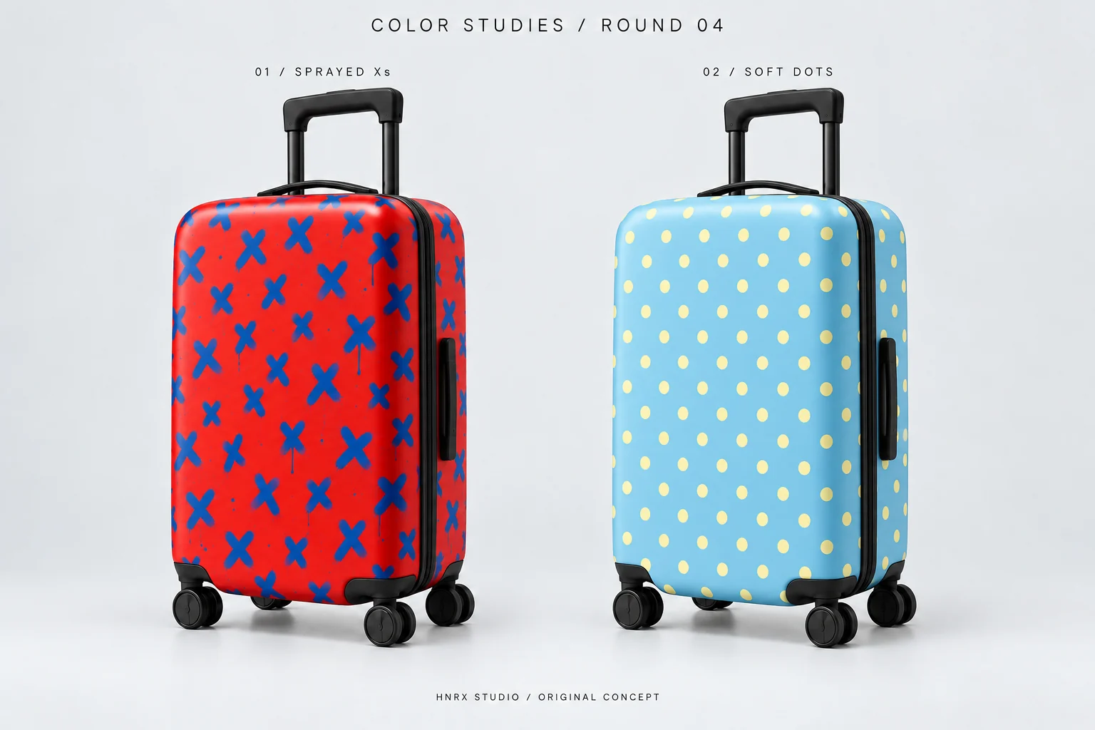
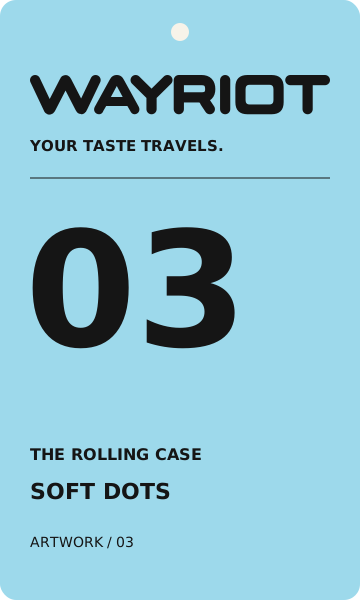
Soft Dots
Sky and butter. A softer rhythm, with the name rising in black.
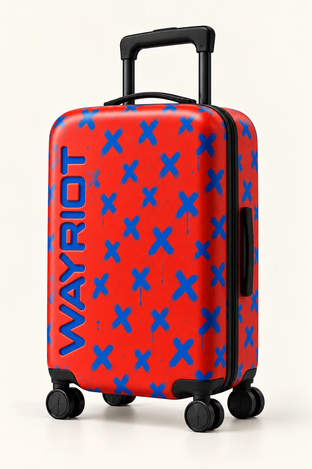
Sprayed Xs
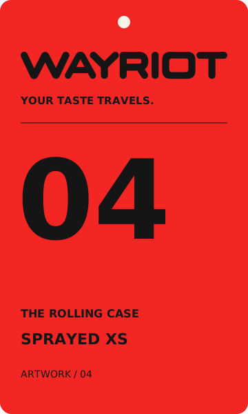
Scarlet and cobalt. Repeated marks, with a rising cobalt name.
Product visualizations for the concept. Surface finishes illustrate the direction; they are not specifications for a manufactured range.
The artwork starts
before the unboxing.
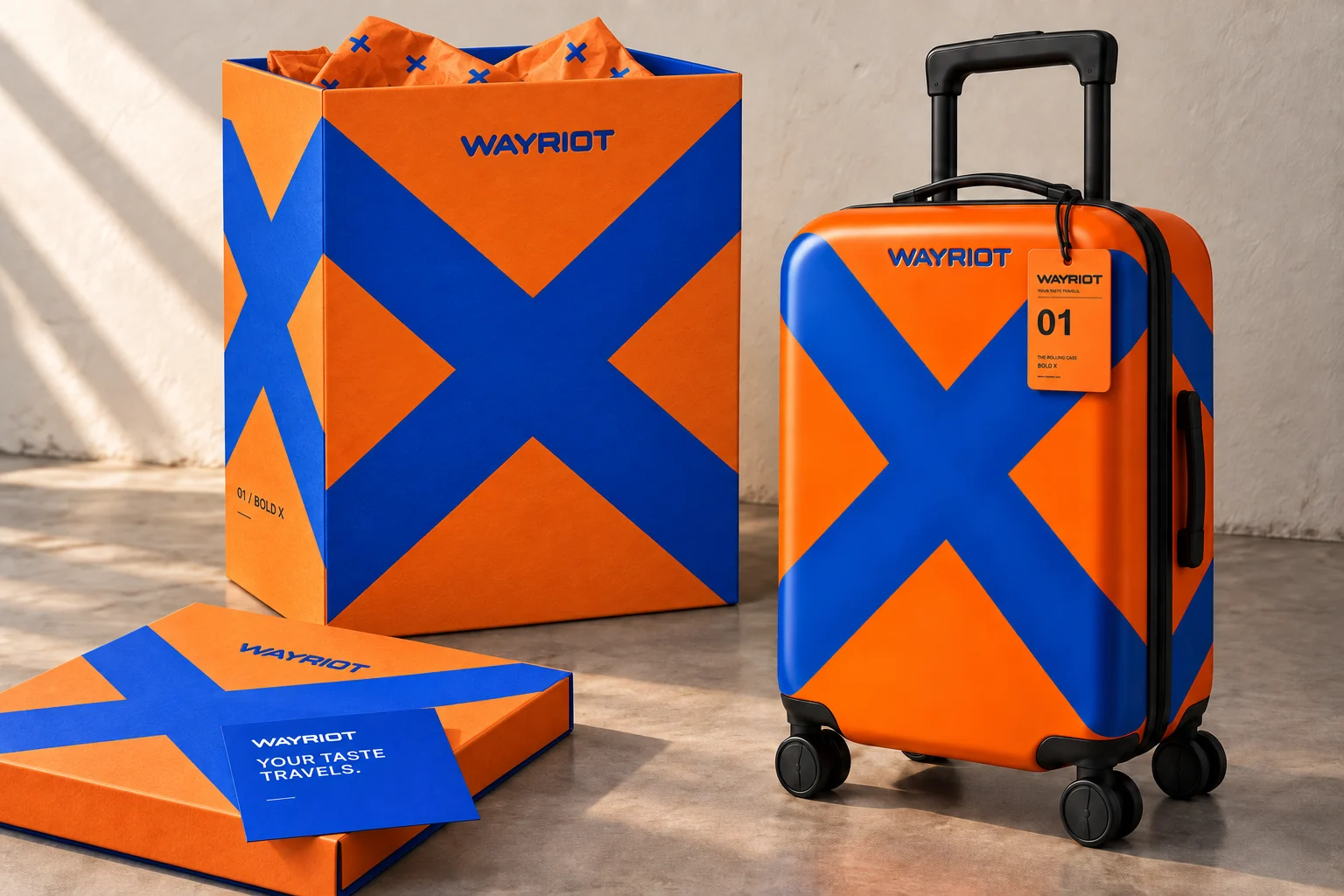
A quiet box underplayed the product’s personality. The selected direction takes the oversized cobalt X around a tangerine exterior, with color continuing through the interior, tissue and insert.
The practical details
belong to the same family.
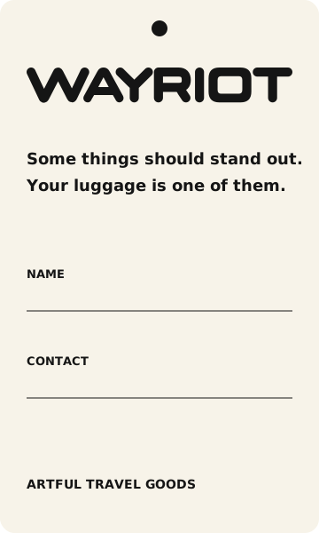
Artwork numbers, a common information hierarchy and an owner-information reverse connect the tags. These are editable artwork concepts; physical packaging would require supplier development.
Taste enters
the picture.
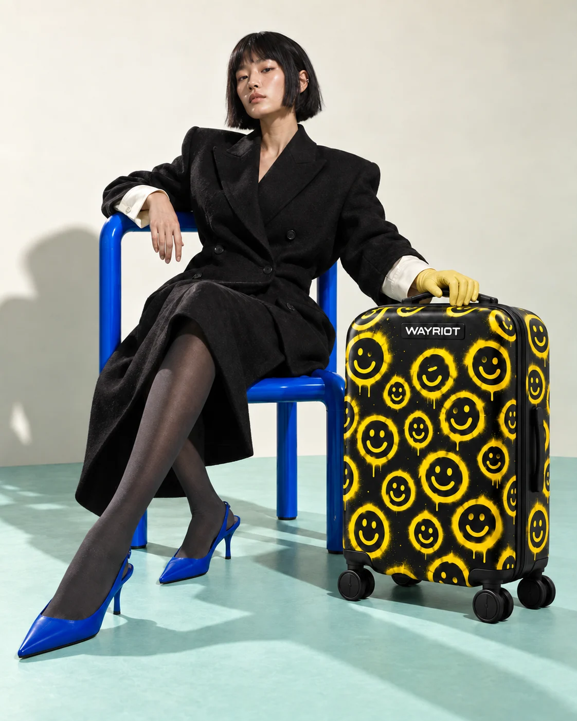
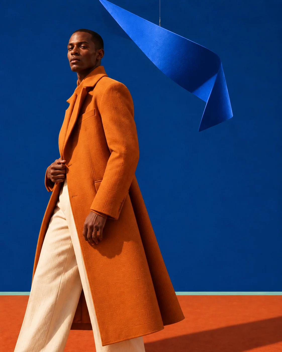
The campaign takes its cues from fashion: deliberate casting, sculptural tailoring and color held in tension. Each image gives the luggage a place in a world with its own attitude.
A shared language.
Room to move.
Ivory and mint give the artwork space. Cobalt connects the set, clothing and cases. Hard directional light and visible fabric texture make the scenes feel tangible.
We established the four case designs first, then checked lettering, proportions, handles and wheels across the new compositions. The camera moves from a full figure to a quiet product study and a close detail.
The world continues
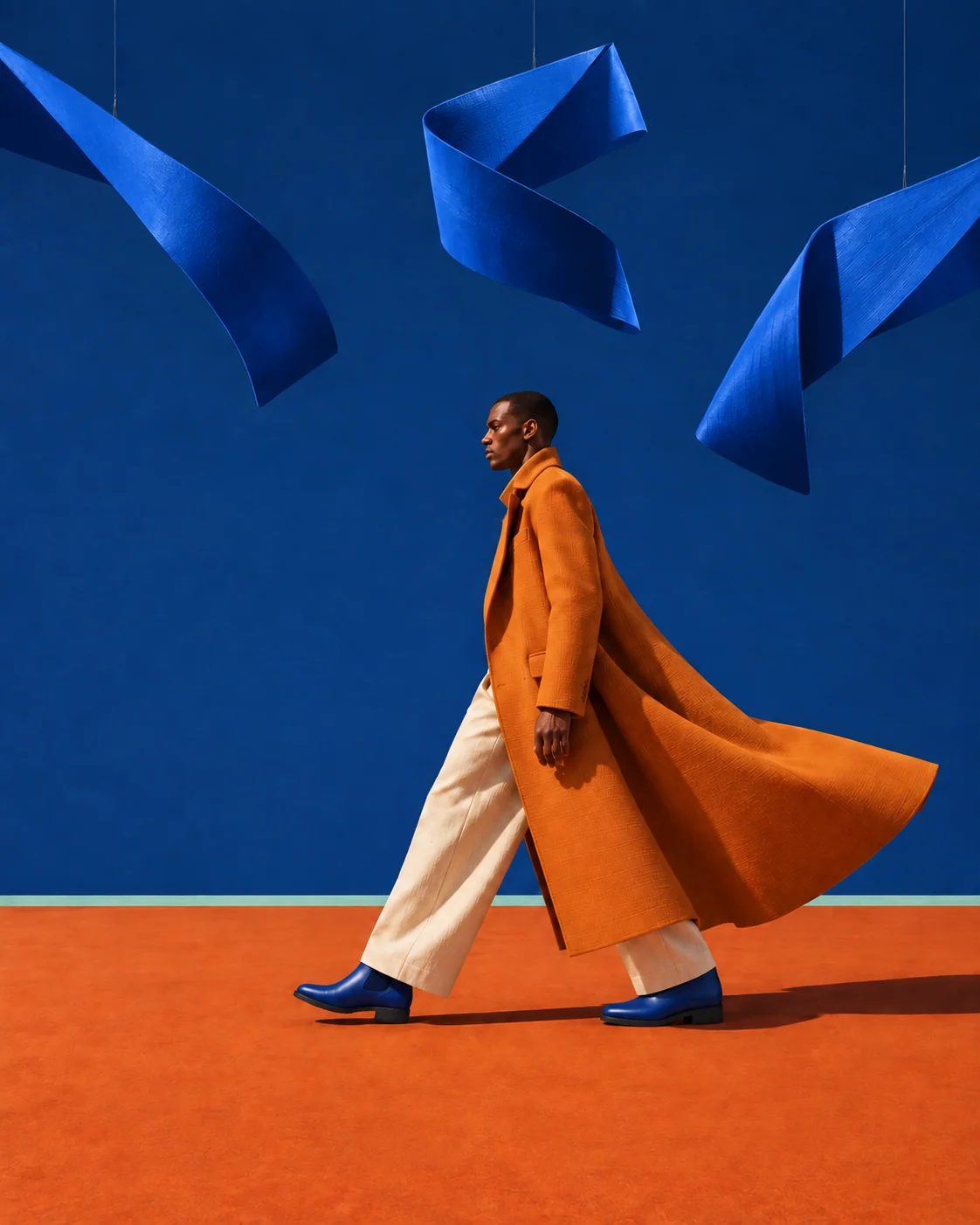
between products.
A saffron coat, cobalt backdrop and suspended forms carry the campaign without a suitcase in every frame. The wider stride and closer portrait give the sequence a change of pace.
Take your own
seat.
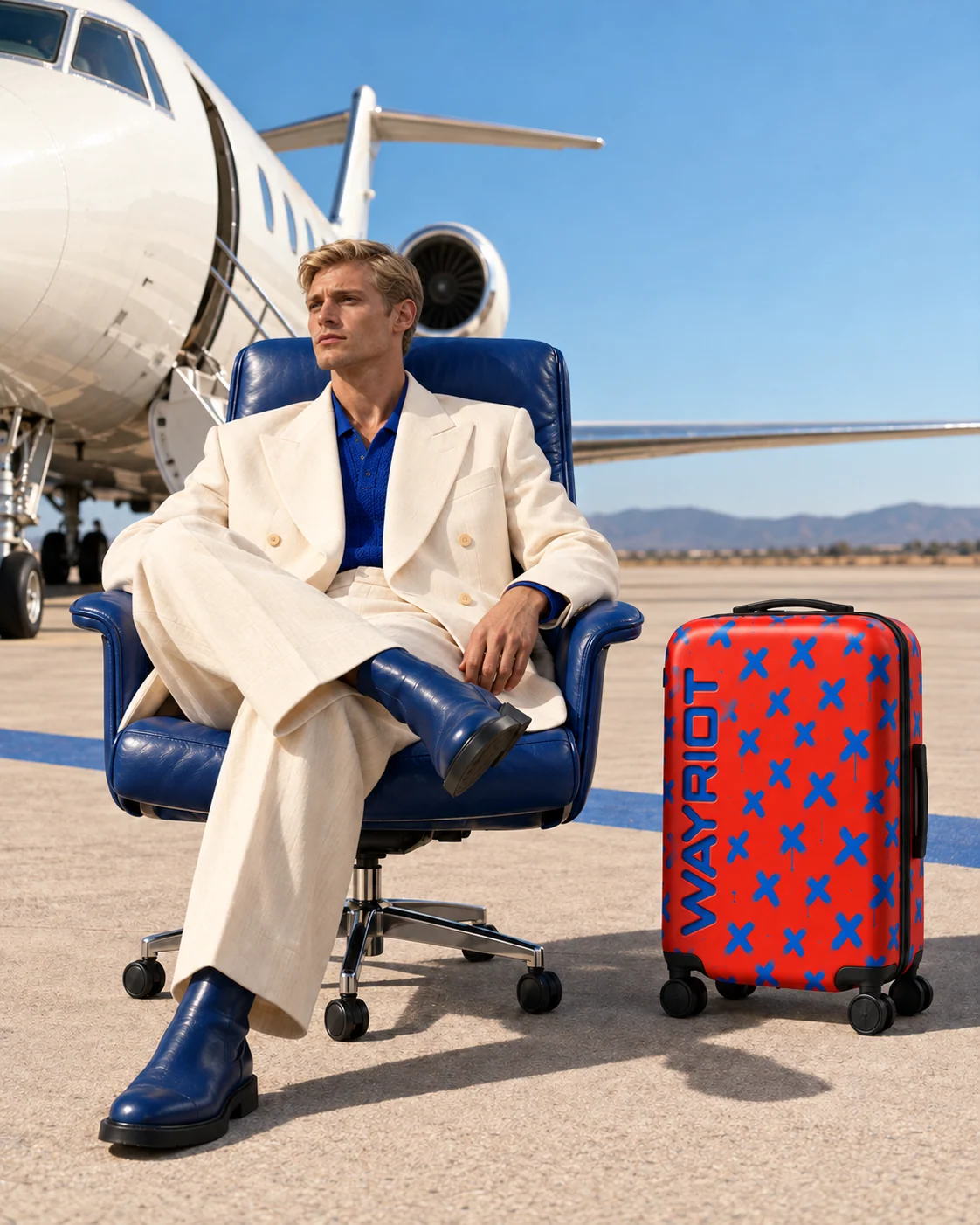
An office chair on the tarmac gives the final scene its unexpected premise. Ivory tailoring, cobalt leather and the red case carry the studio palette into an open-air setting.
Distinct casting and a new location extend the campaign while the product and visual language stay recognizable.
Designed for
the page.
The web layouts give typography its own space alongside the complete photographs. Portraits retain their framing as desktop spreads become a vertical sequence on a phone.
Terminal Rhythm.
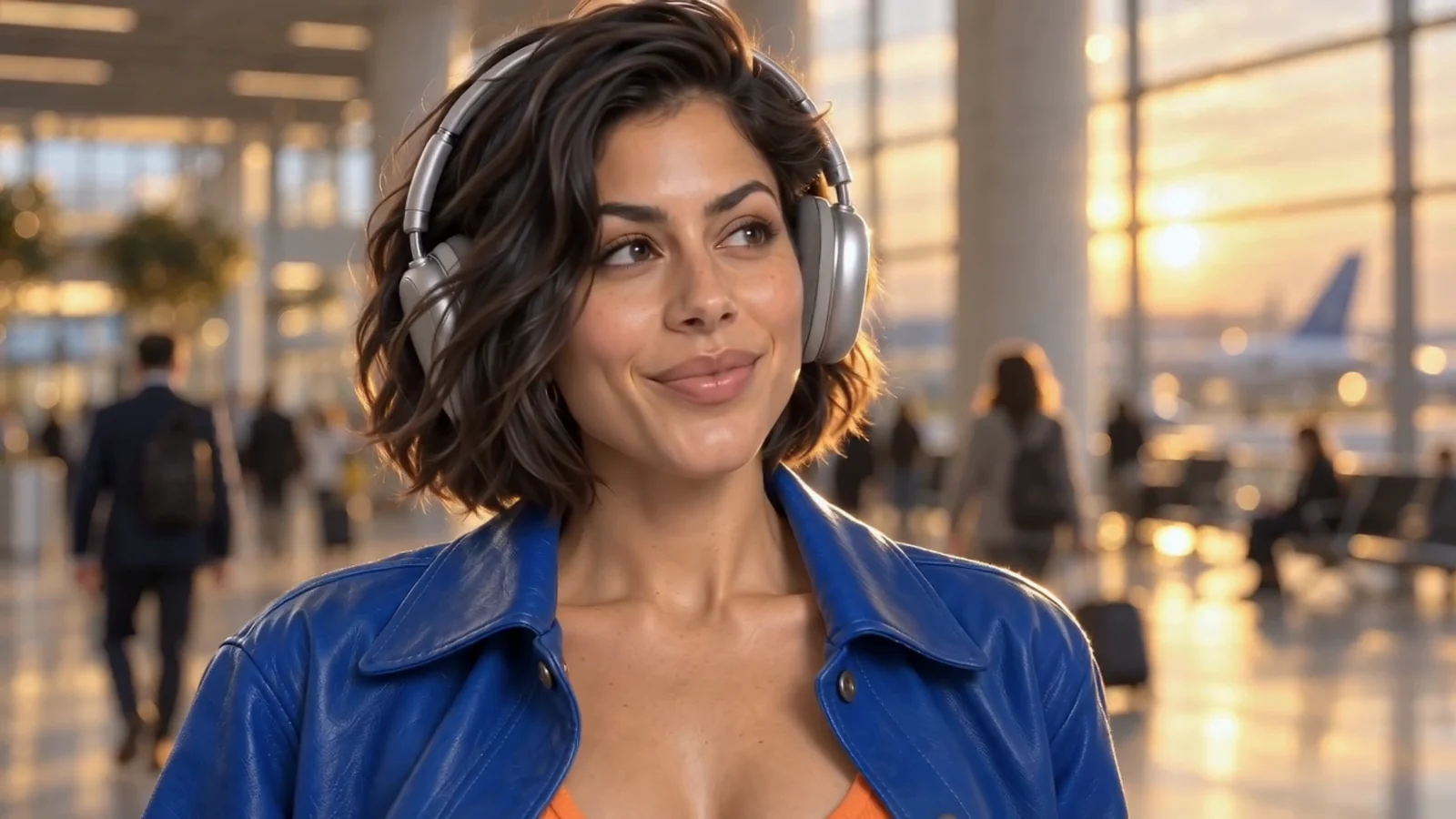
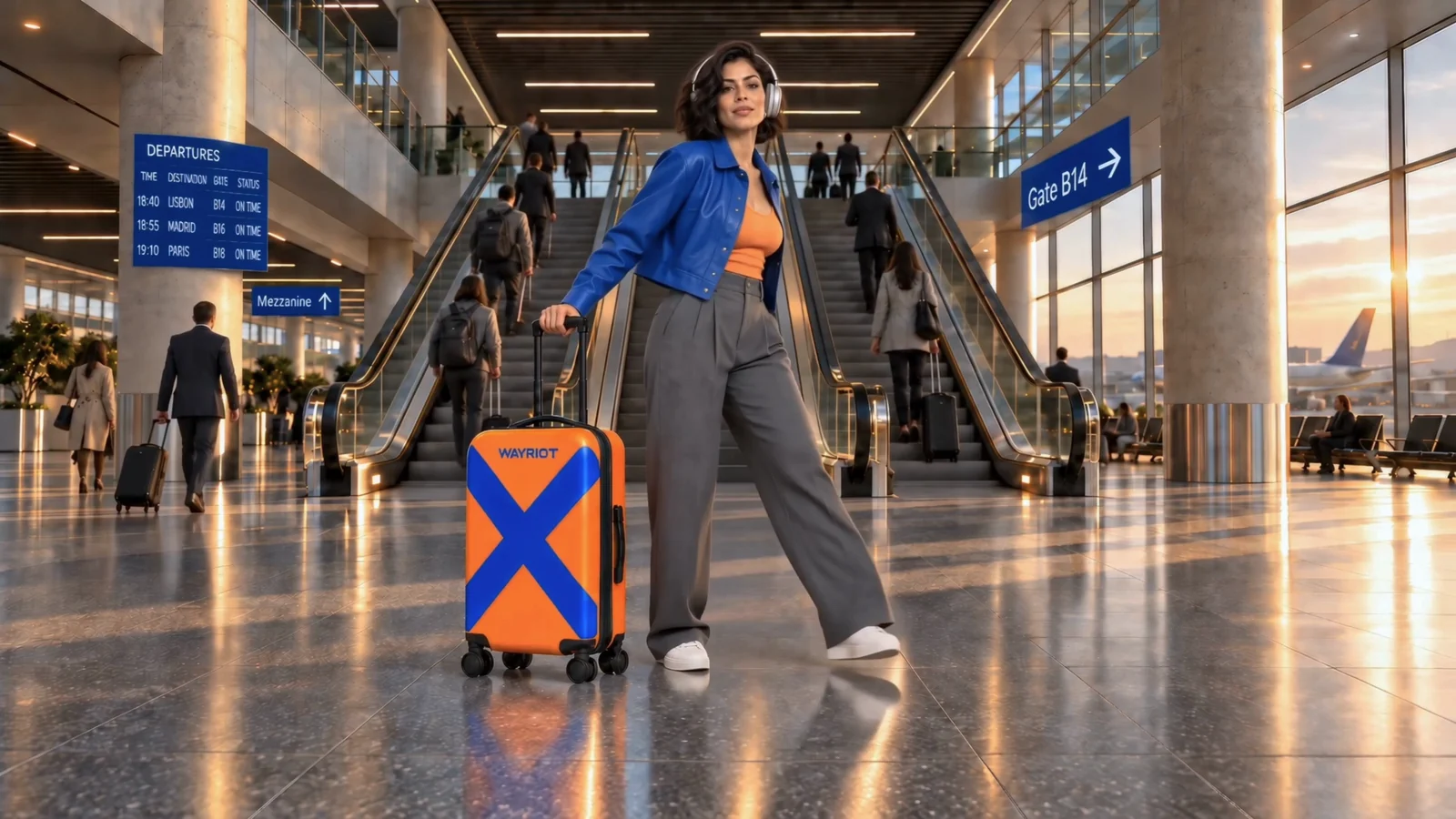
An ordinary airport. One traveler catches the rhythm. A private feeling becomes a shared moment, then everyone carries on. The brand’s personality becomes the story.
Sound on for the complete film. Music: “Set Me Free,” created by Pedro Henriques with Suno. Creative direction and edit: Pedro Henriques / HNRX Studio.
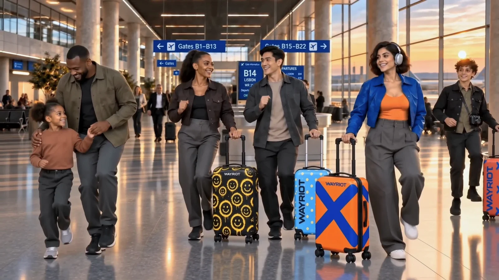
A world that
holds together.
The film grew from an approved character, a planned terminal and individual shots. The work between those shots was as important as the images themselves.
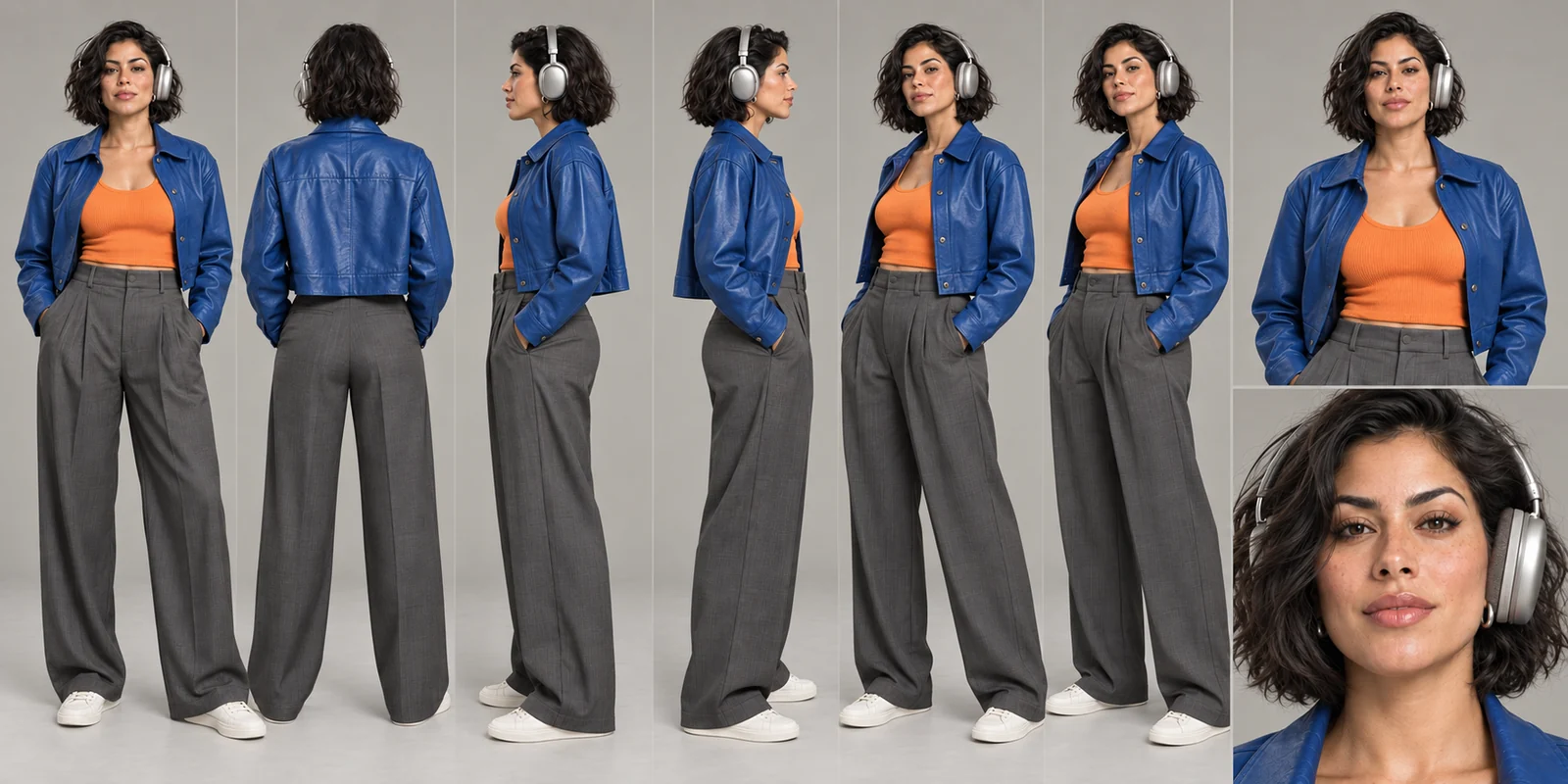
Recognizable
from every angle.
Her dark bob, silver headphones, cobalt jacket, orange top and gray trousers establish the lead. The orange Bold X case stays part of her character throughout the journey.
Supporting travelers have their own wardrobe and luggage assignments. Their reactions build the moment before the group joins in.
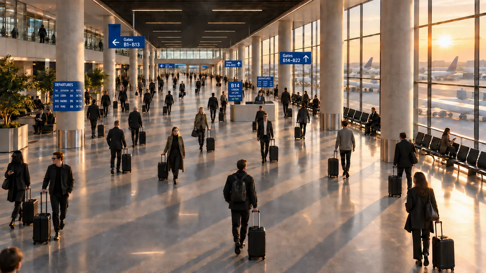
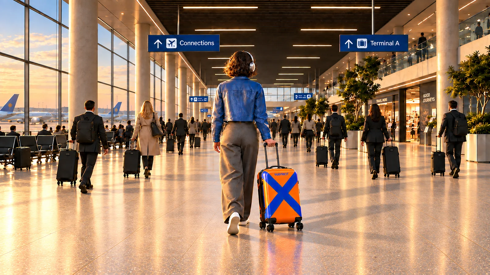
The airport has a route.
The approach establishes B14. The exit faces the other way: the window wall changes sides and the signs lead toward connections.
Small details carry the world.
We tracked characters, bag ownership, signs, lighting and physical contact, comparing each selected shot with its neighbors and the fixed references.
The edit gives it a pulse.
The 126 BPM track shaped the movement and cuts. The final edit brings airport sound into music, then finishes with a restrained color pass.
From a product idea
to a complete brand world.
A name, an identity, a four-piece concept collection, packaging, campaign imagery and a finished film. Each makes the same idea visible in a different way.
Foundation
Positioning, audience direction, naming rationale and brand voice.
Identity
Vector wordmark, color and typography rules, artwork applications and brand guide.
Campaign
A ten-image fashion campaign, responsive web layouts, character development and a complete brand film.
WAYRIOT is an original HNRX Studio concept, not an external client commission. The products are fictional and are not offered for sale. The case study demonstrates design and production work; it does not claim a manufactured launch or measured campaign results.
Your taste travels.