TARDE.
An afternoon, bottled.
An already-branded bottle on a kitchen counter became the starting point for a fictional hibiscus drink campaign. We built a coastal world around the product and created images with different jobs to do.
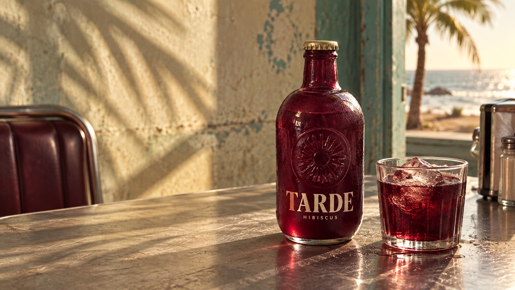
Make a drink feel like a way to spend the day.
A clear bottle photograph can describe a product. A campaign needs to give someone a reason to care about it. Our concept places a hibiscus drink inside an unhurried afternoon: cycling to the beach, opening a cooler and staying for one more game.
This is self-initiated studio work. TARDE is fictional, and both the starting reference and the finished campaign images were generated with AI. It demonstrates a creative process; it is not an external client commission or a report of sales results.
Begin with what is there.
For this photography demonstration, the starting reference already carries TARDE branding. Its plum glass, gold cap, ivory lettering and embossed emblem give us the cues for the campaign palette and visual direction.
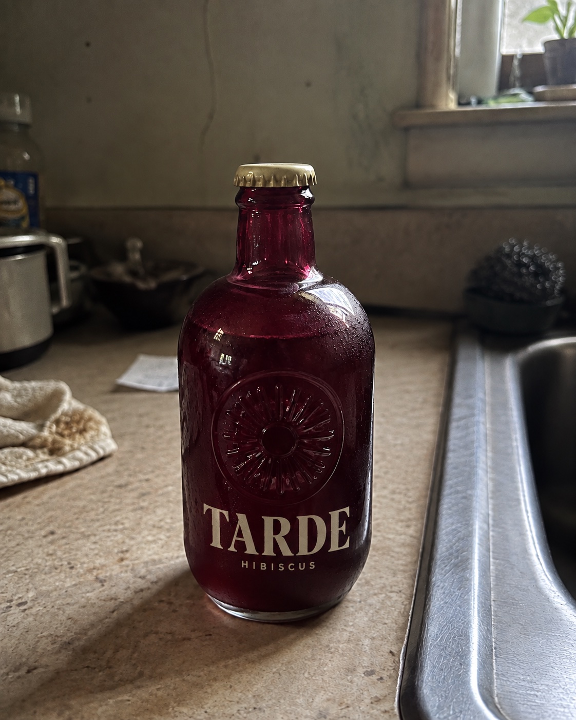
Existing branding. Ordinary kitchen light.
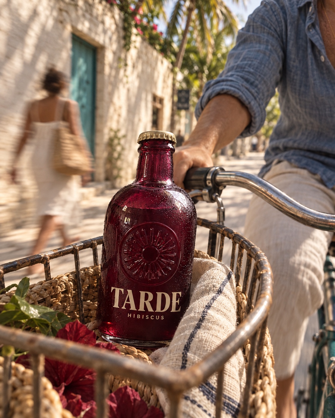
A product with a place, a mood and a story.
The product leads the direction.
We used the branded bottle as the product reference for each scene. The creative work here is the atmosphere, composition, lighting and role of each image within the campaign.
Name, packaging and product details guide the imagery.
An afternoon worth slowing down for.
That idea gives the campaign its direction: lived-in coastal places, friends, warm light and a cold drink. The bottle’s plum glass becomes the color that connects the scenes.
- The product: plum glass, a gold cap and an embossed sunburst.
- What stays: the existing TARDE wordmark, ivory lettering and packaging details.
- The world: Tulum streets, beach afternoons and an evening around the table.
Your existing brand is the starting point. We agree the visual direction and intended placements before creating the campaign images.
Different moments. A shared feeling.
Sunlight becomes twilight. The camera moves from the street to the table to the surface of the glass. Plum, ivory, faded teal and warm light hold the direction together.
Take the product somewhere.
The bicycle basket gives the bottle a journey. Moving street life, faded blue linen and warm plaster suggest a relaxed afternoon rather than a studio setup.
Designed for: discovery and lifestyle social
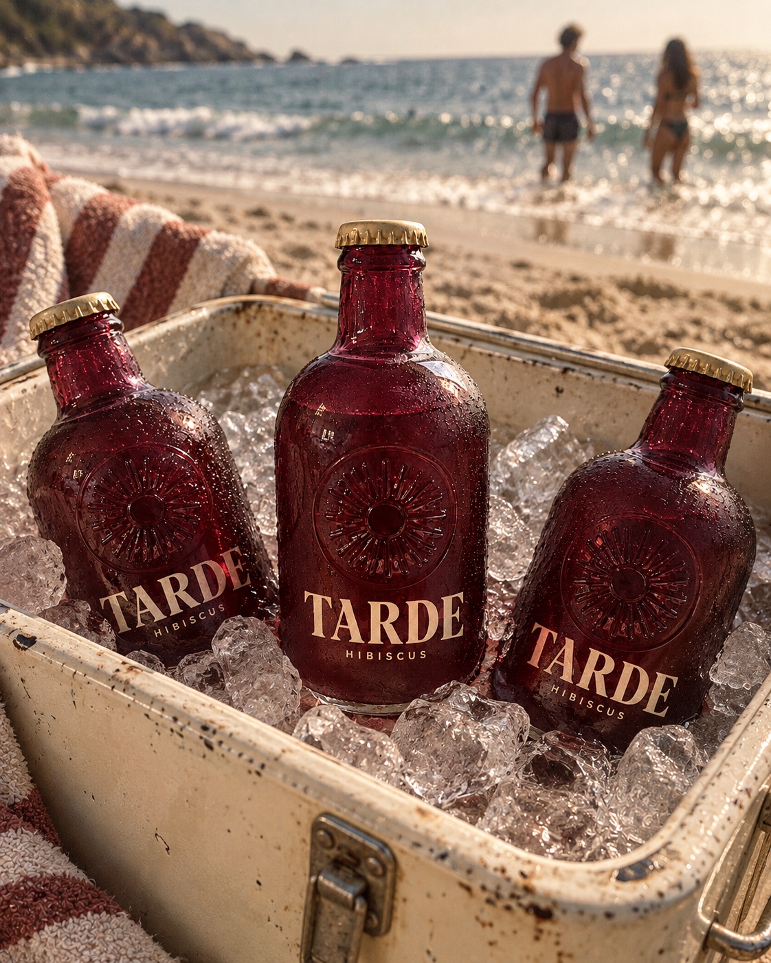
Make cold feel tangible.
Ice, condensation and friends at the water give the drink a reason to be there.
Designed for: seasonal social and refreshment stories
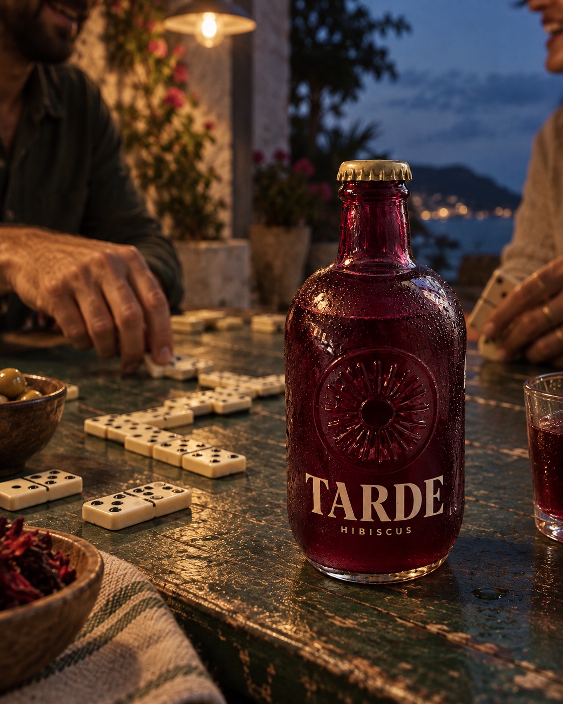
Give the product company.
A new camera position and evening light shift the story from a sunny afternoon to time around the table.
Designed for: editorial storytelling and social
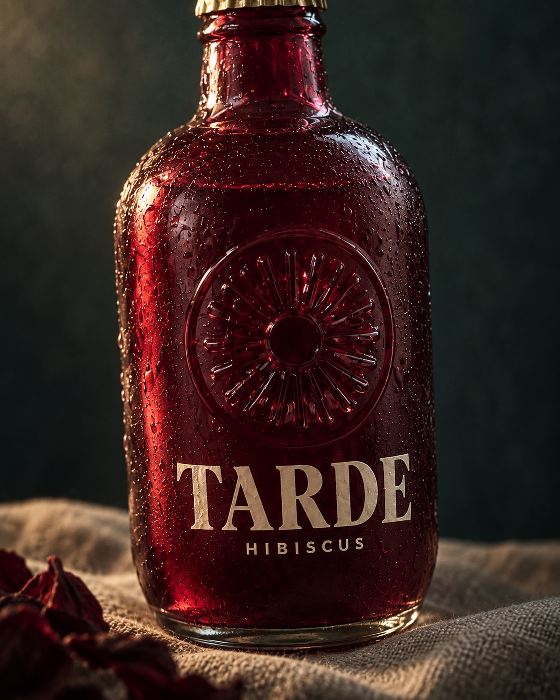
Let people look closer.
A separate three-quarter material study brings the embossed glass, ink and droplets into focus.
Designed for: product pages and packaging detail
Room for the message.
The diner image gives the complete bottle a quieter stage. The open space on the left is intentional: a website headline or campaign message has somewhere to sit.
Give the placement its own frame.
We used the finished bicycle image as the reference for a new landscape composition. The wider scene keeps the bottle complete and creates usable space around it.
Social feed composition.
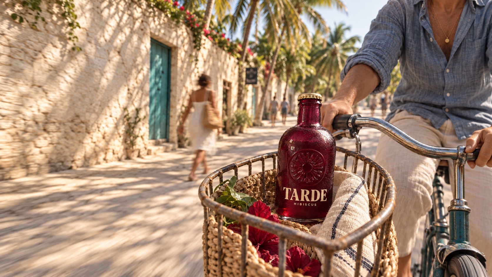
Recomposed with more scene and room for a message.
This study contains five distinct campaign shots and one landscape adaptation. It shows one example of the paired formats included in the product Starter Pack.
Your product sets the rules.
We review your product photos, packaging artwork and intended placements, agree the direction, then develop and refine the images against those references. Shape, lettering, materials and the complete product need deliberate checks before delivery.
These are concept images, not production packshots. A real-product commission includes reference review and refinement; generated imagery can introduce variations in geometry and lettering. Naming and packaging design are separately scoped when needed.
Have a product ready for its next chapter? Start with your existing photos and tell us where the images need to work.
Explore product photography